Work
Design System, Research, UI/UX, Inclusive design
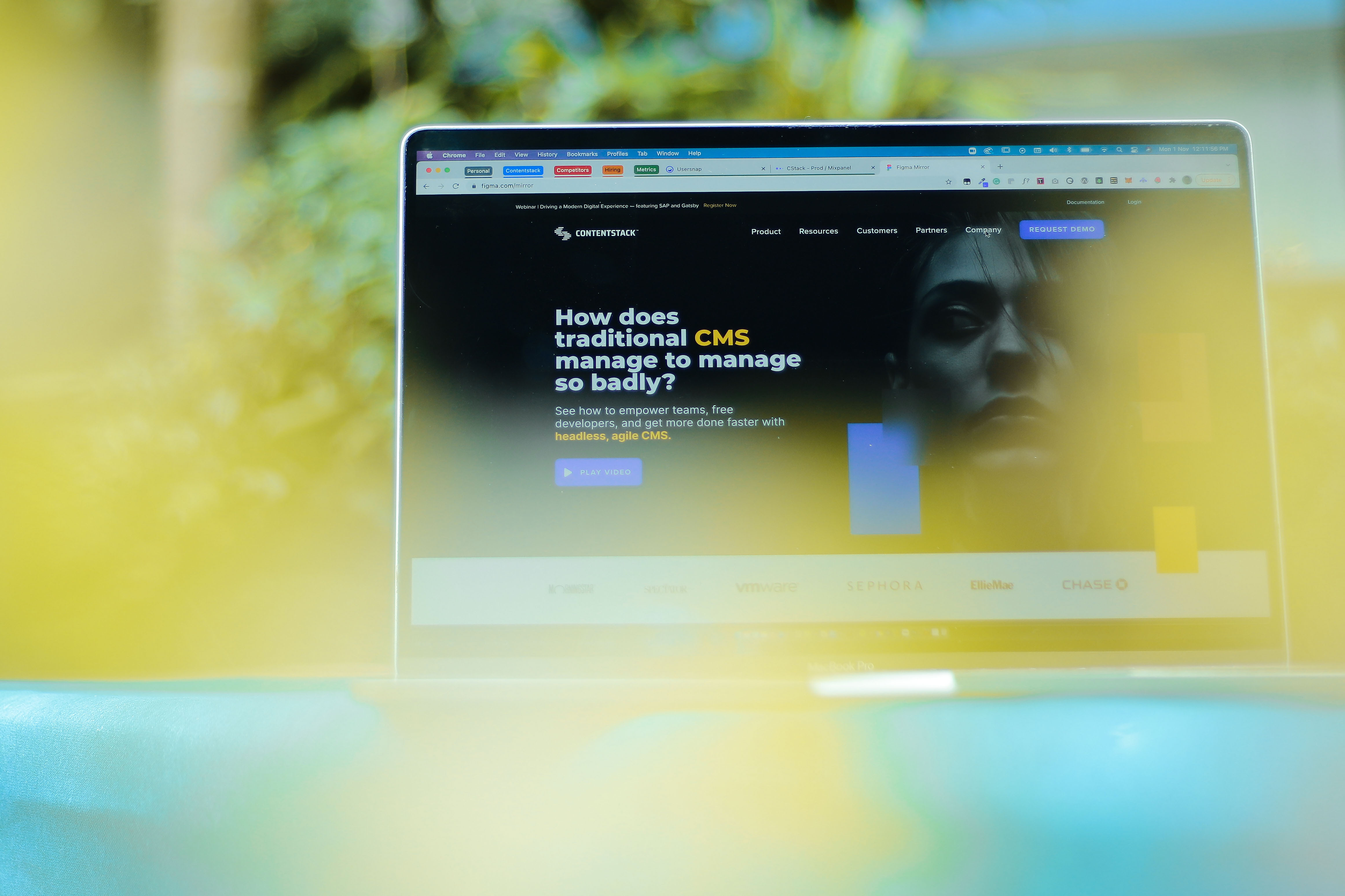
Contentstack is an API-based, headless content management platform that allows developers and content managers to create and manage content simultaneously and independently, to create websites and applications quickly.
Contentstack was launched in 2018 as a startup. It then grew to be world’s number 1 headless CMS which serves billions of API calls a day and petabytes of content to its users every month..
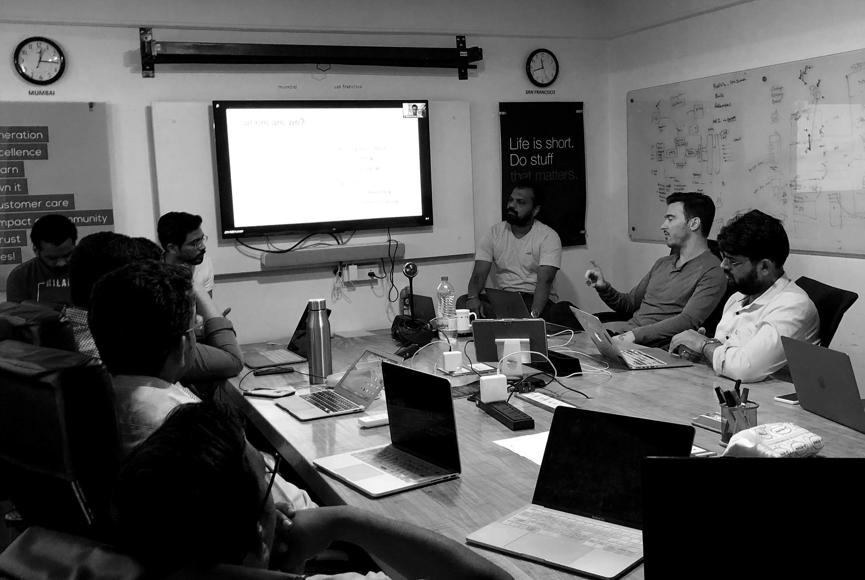
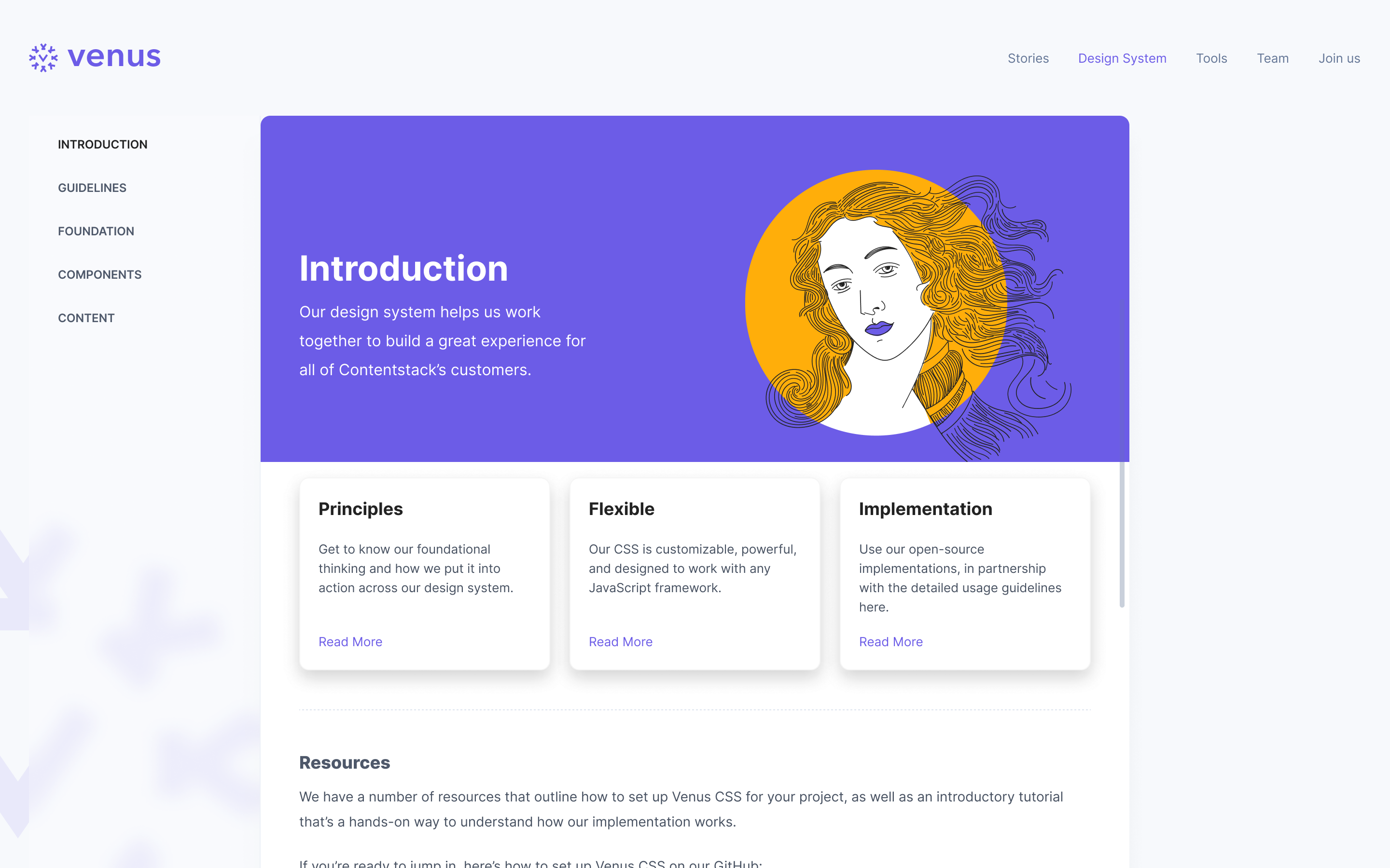
I lead product design at contentstack. Among other responsibilities, one of the major goals I set for my team was to release a design system internally and a part of it publicly for customers (developers) to build marketplace apps and widgets.
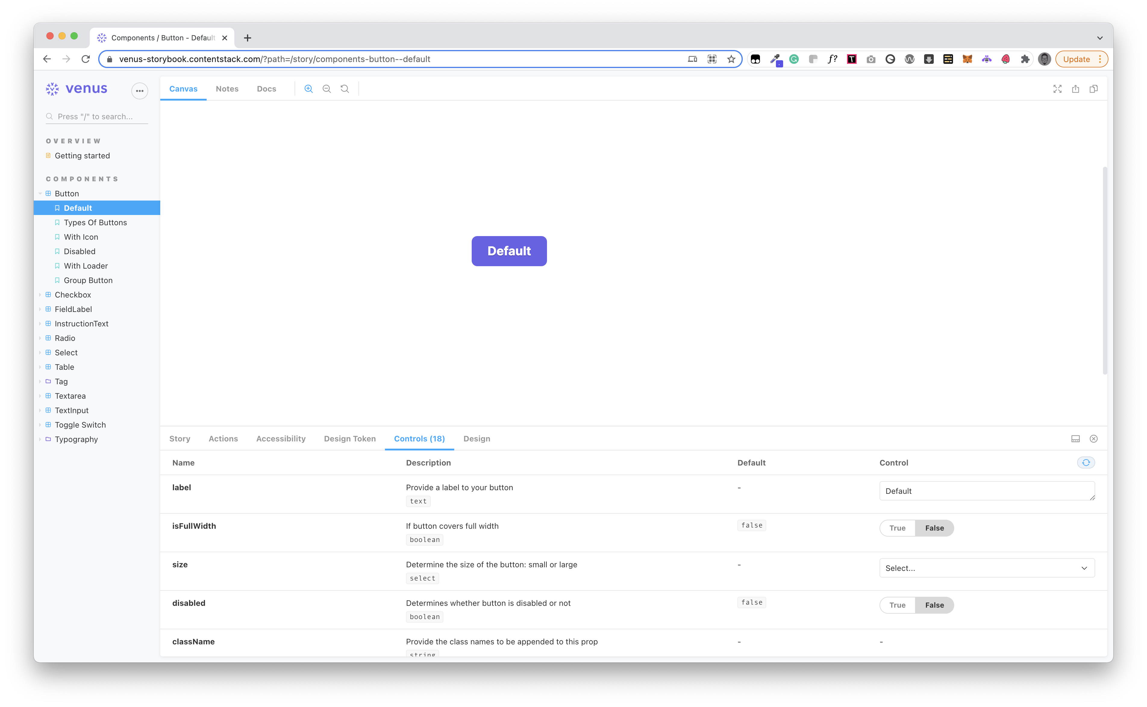
6 Designers
whimsical, zoom, figma, storybook
Jan 2020 - On-going
All the designs are scattered across different agencies and we lack consistency in some areas of the product
Primary users of the system are going to be the developers who will be building widgets and marketplace apps for the clients.
Secondary users are going to be us - designers and engineers.
How does one go about creating a Design System for a complex and growing web application? I didn’t know the answer so we started this project with some heavy research. We read medium articles, studied the guidelines laid out by Google, Facebook, Apple, Airbnb, and Atlassian, and searched for other designers who faced a similar challenge.
Based on the research, we captured these goals for all stakeholders, which became a direction for the project.
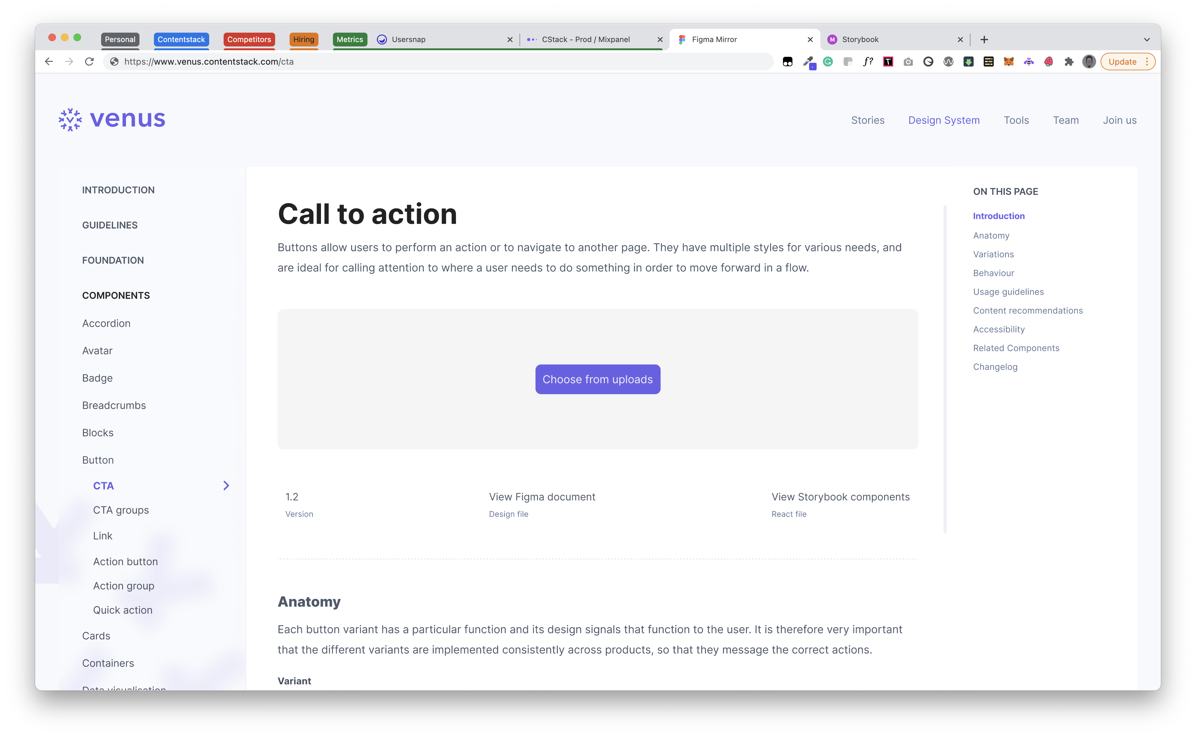
We wanted to build widgets or marketplace apps that should look like an extension of contentstack.
We wanted to reduce the development effort by identifying common components. Also, changing at one place should reflect throughout the app.
Without slowing down the process much, we wanted to bridge the connection between designers and provide a consistent experience for our users. Also getting the updates on the changes/additions of components to design system
“Why do we have different font weights and paddings for the titles of the fields?” Harshal — Engineering Manager
“The primary buttons in some places have an icon and in some places it doesn't..” Sinal — Front End Engineer
To learn the proper approach for the definition of the structure and guidelines of our components, we set up a team of designers and engineers. Our high-level objective was to have a set of elements that could coherently co-exist within a larger system. George did learn about Atomic Design methodology and figured it will work well as the foundation of our system.
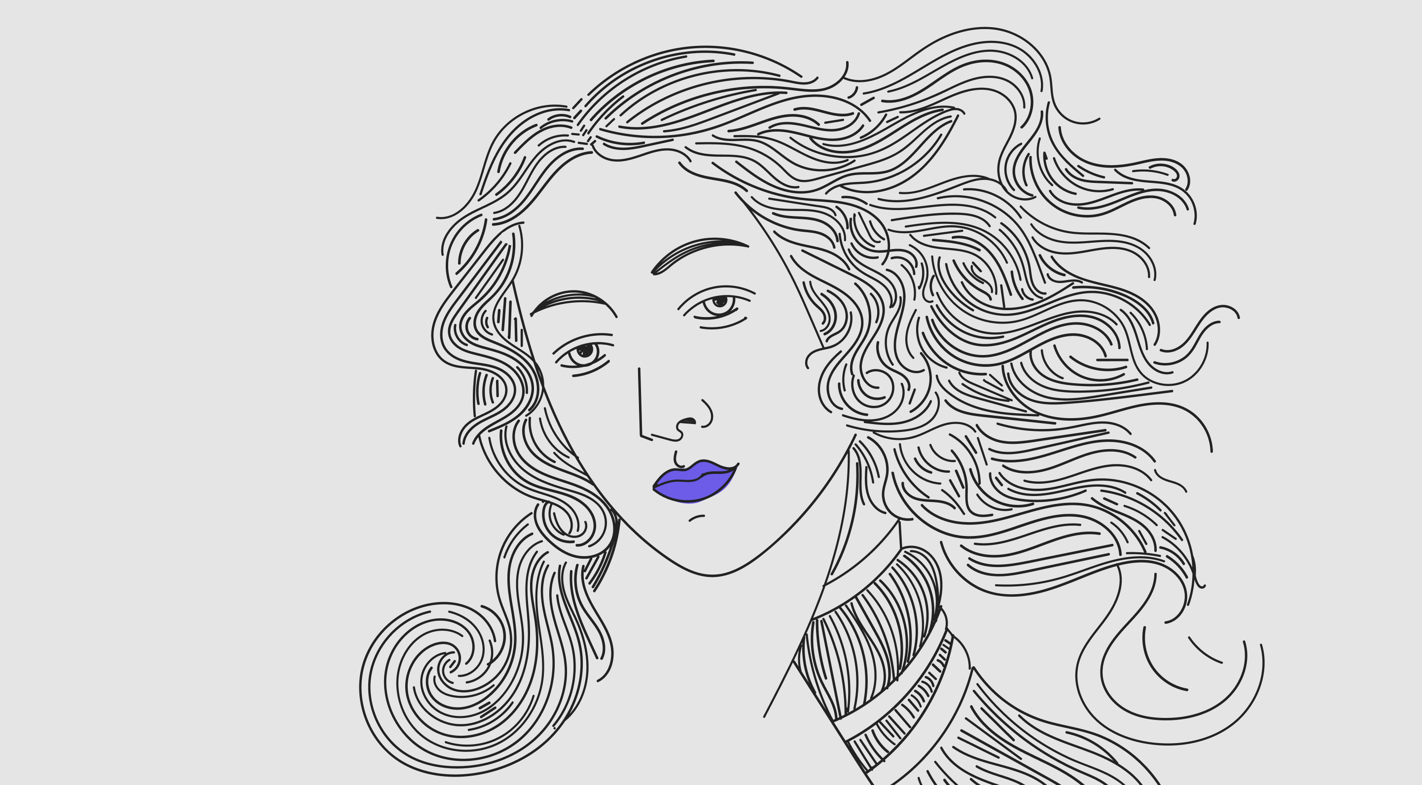
As designers, we take huge pride in our design’s beauty and functionality. And this has inspired us to name our Design Language Venus. Venus (/ˈviːnəs/) is a Roman goddess, whose functions encompassed love, beauty, desire, sex, fertility, prosperity, and victory.
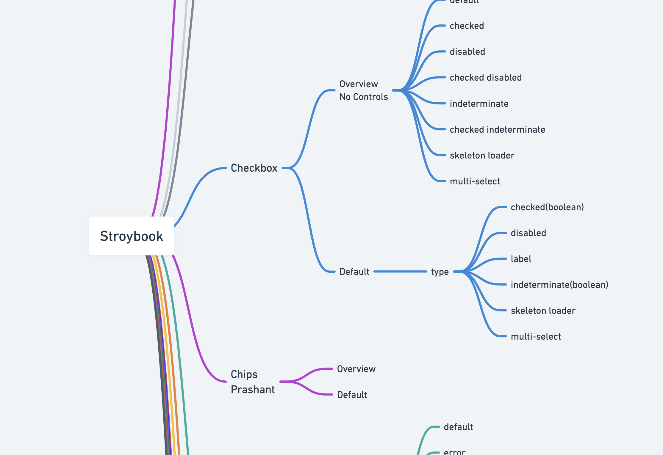
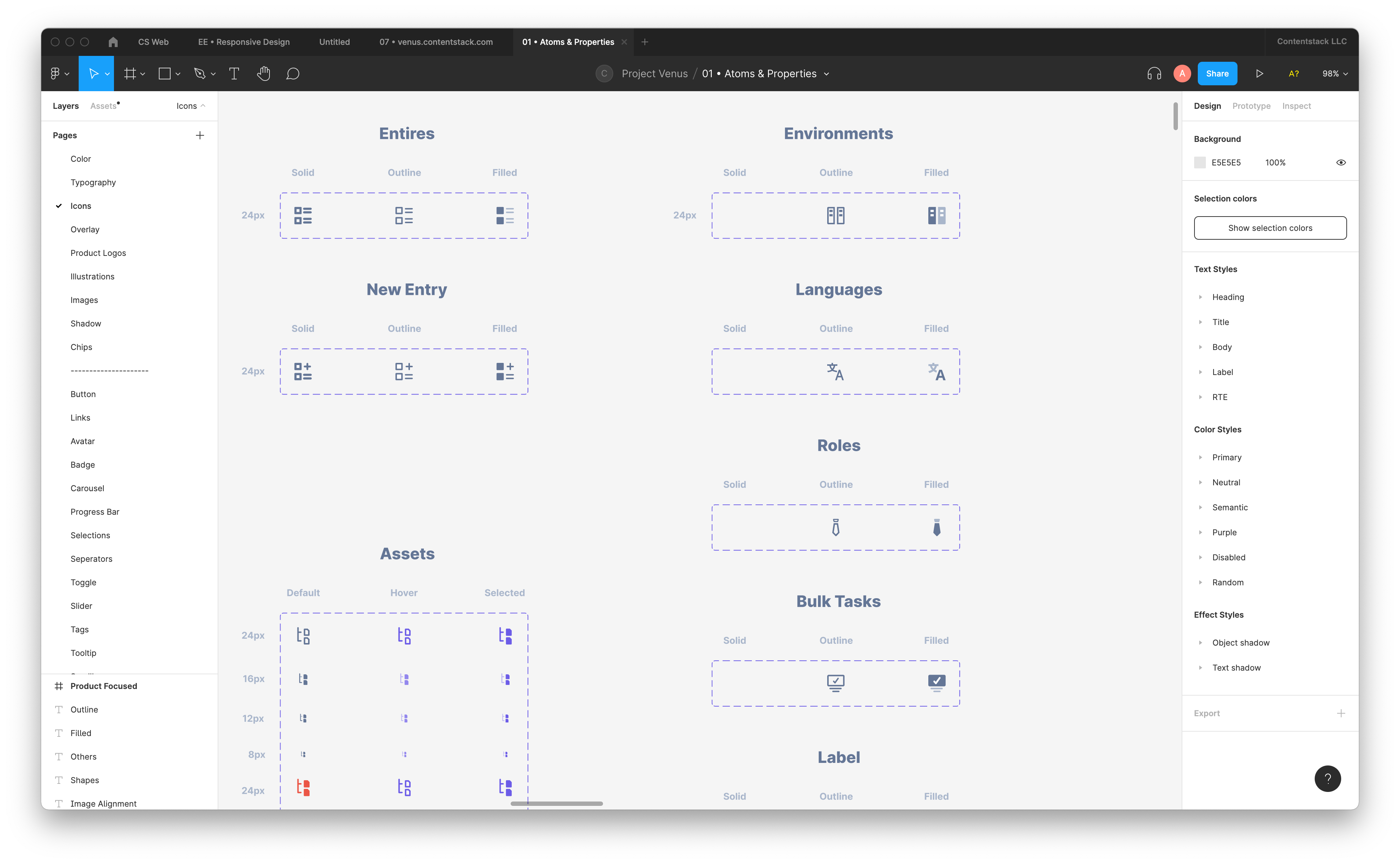
For our application of the Atomic Design approach, Vini used whimsical to list out the entire components that are used on our platforms and organized them into an initial structure of atoms, molecules, and organisms.
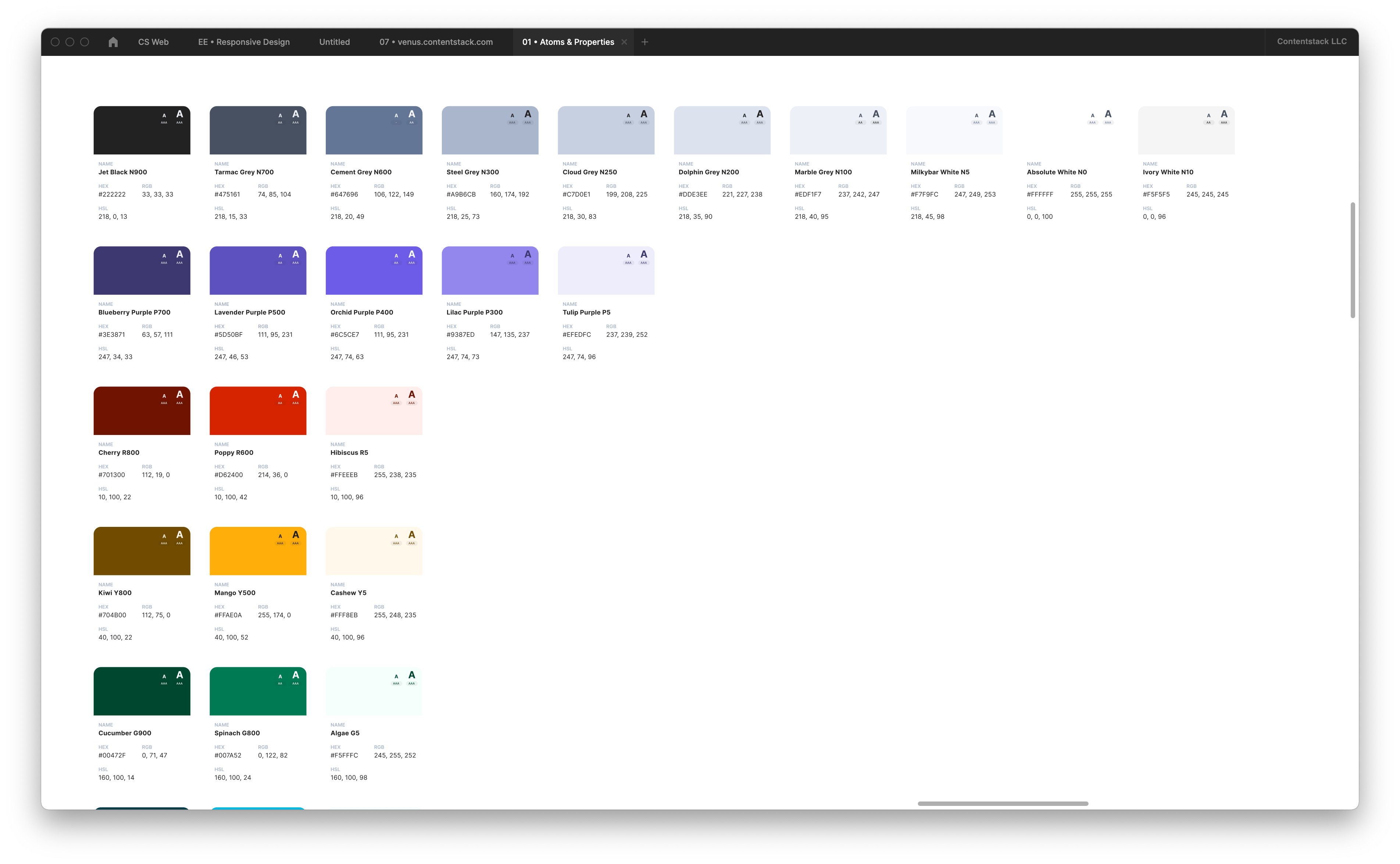
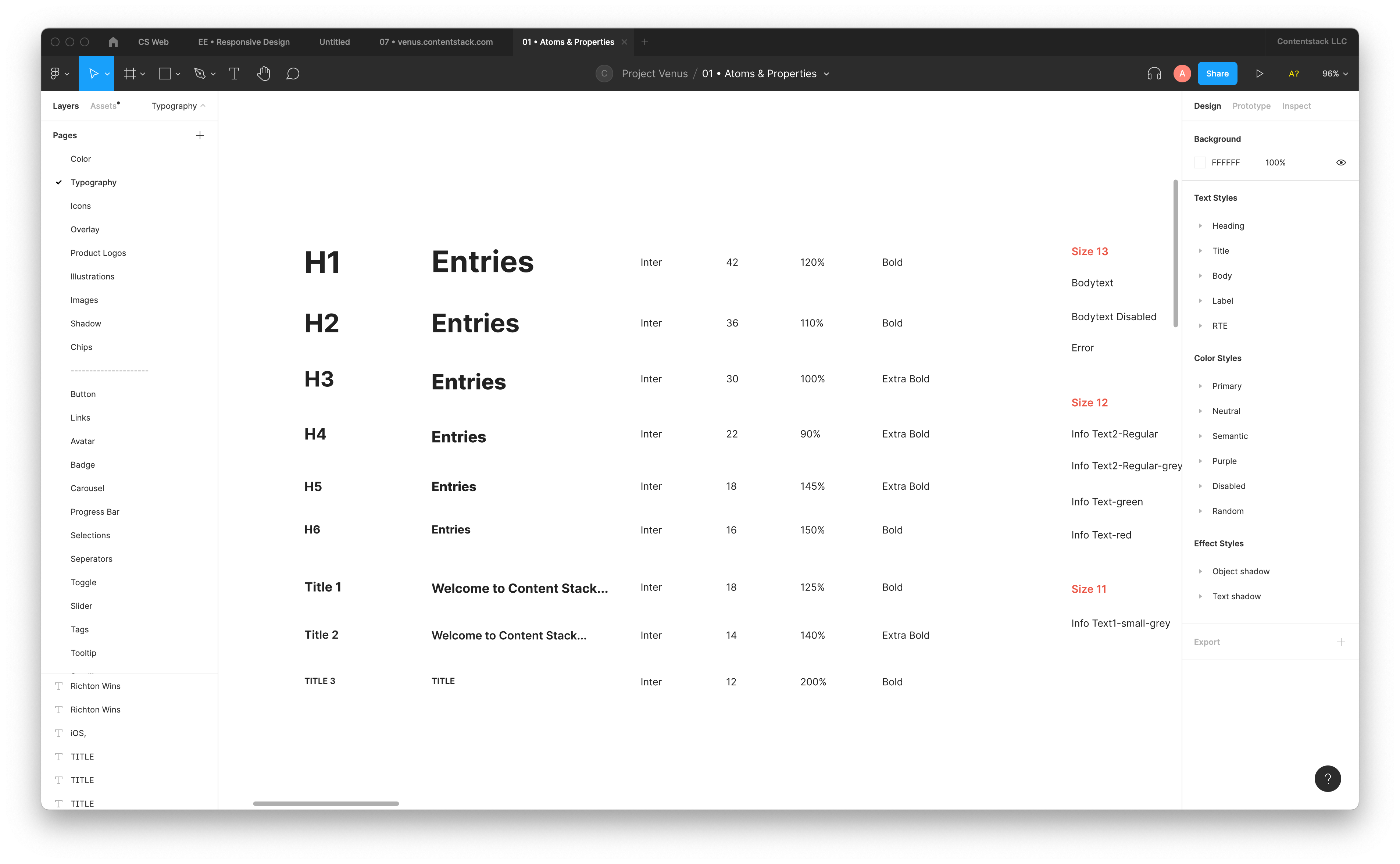
We started with atoms, the smallest units, that will be the foundation for our design system; namely typography, colors & spacing.
Working on our design system has been very challenging, but it has brought about many positive benefits for the company on different levels.
Can create widgets/extensions/marketplace apps that will provide a consistent experience and it feels like it was a part of the app itself.
The process of solving this issue has been a major learning ground for the whole design team. We are not experts in building design systems. However, we experienced many challenges that allowed us to improve our soft and hard skills. Here are a few of the learnings:
We started with figma free plan initially and started creating components. We were of the assumption that once we have a paid plan and Org created on figma we can migrate it. We found that it's not how figma works - Orgs are fundamentally different from other teams created on Figma, in that they exist in a space that's separate from the rest of the platform — by design, they're not meant to interact with teams and users outside of the Org.
“This makes our extension creation process seamless.”
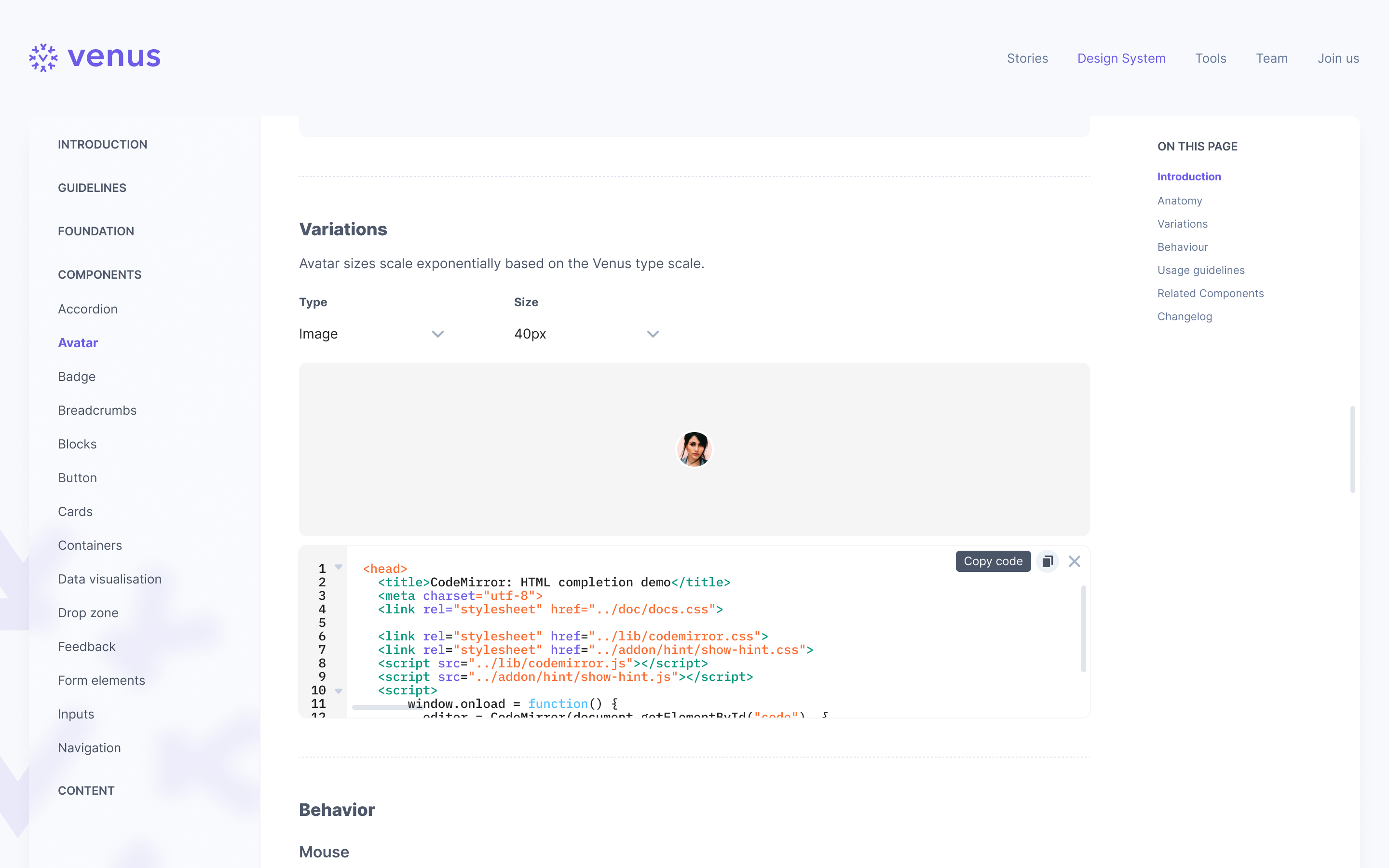
This is the general notion we are getting from our customers. While this is just beta and our proper version of the design system is yet to be released. We wanted that to be the place where we talk about everything design - experience, philosophy, story, anatomy, version etc.
Rock solid team who made this happen -
George - Helped with research on Atomic Design Methodology and documented major components.
Vini - Helped with extensive research and defined the information hierarchy.
Raviraj - Did constant check on the design system and developed components. Helped in adding components.
Prashant - Helped in documenting components and made sure the system is clutter free. Variants only when we have the absolute need of it.
