Indian 2000 Rupee Note Redesign

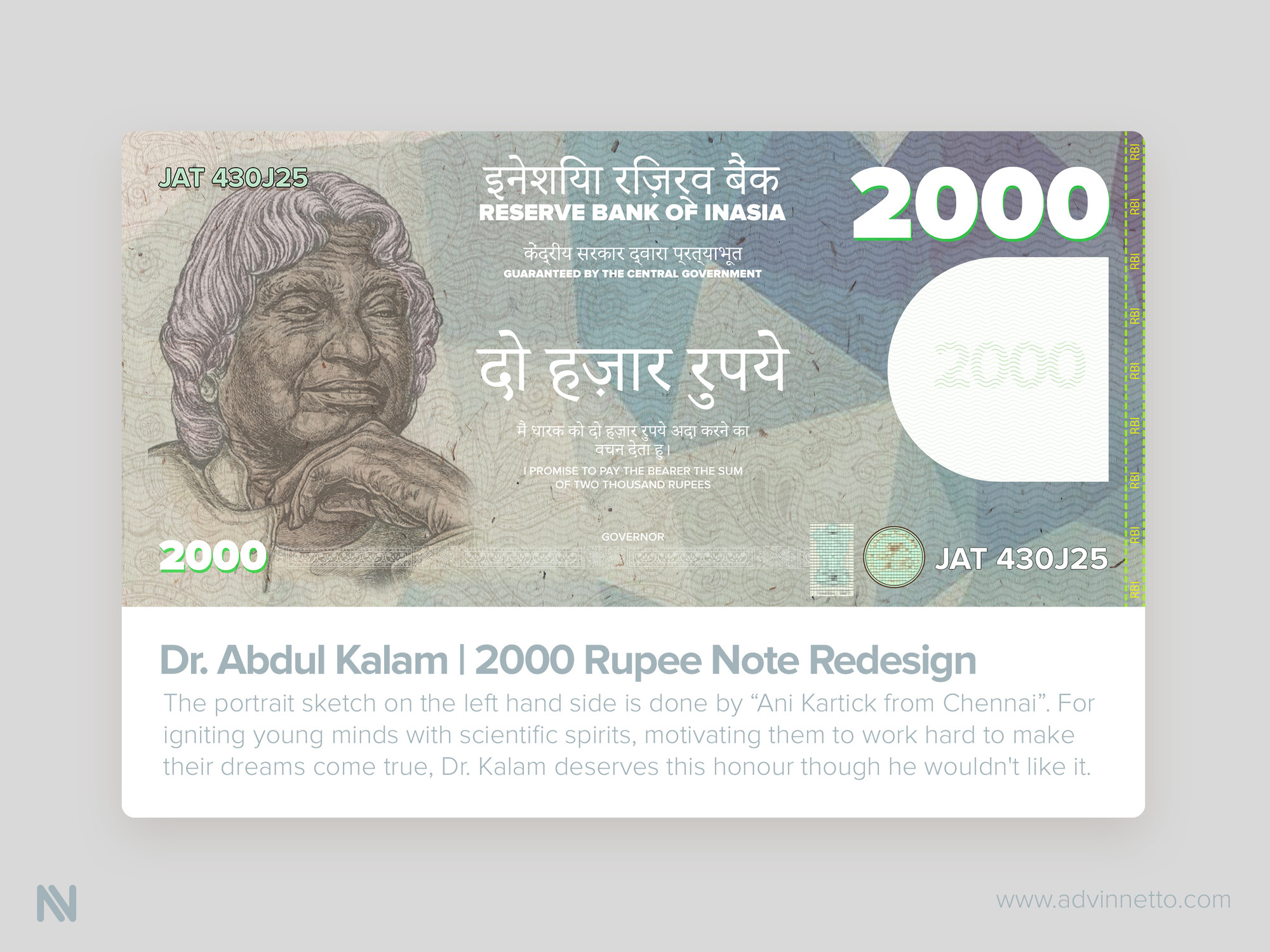
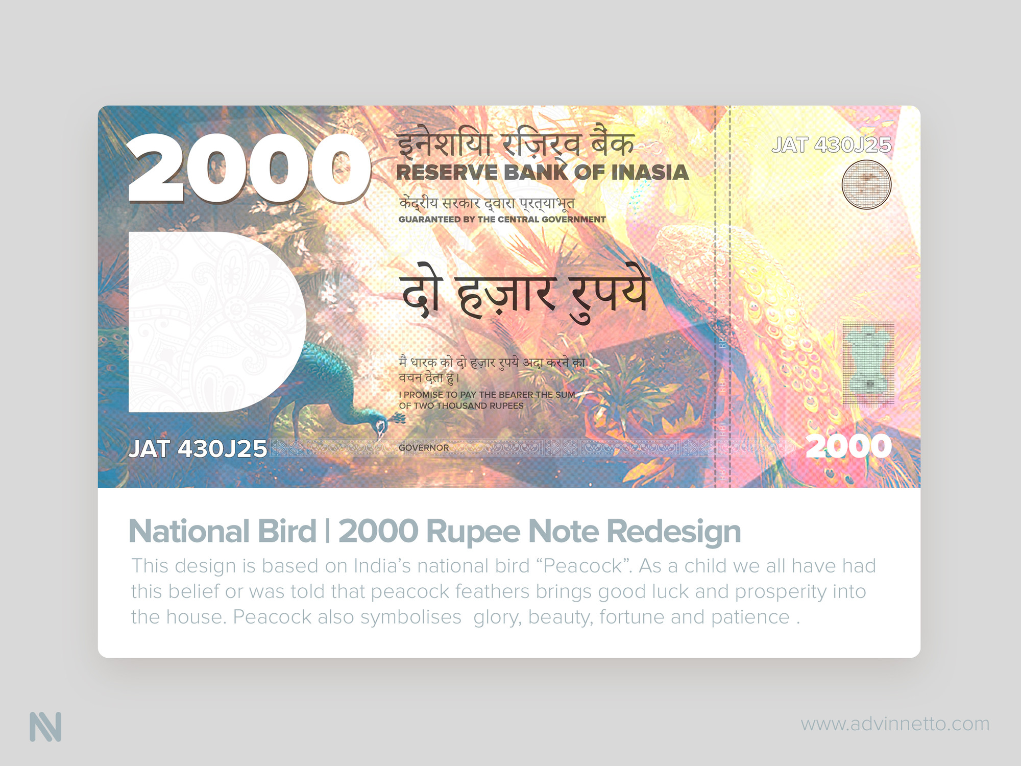
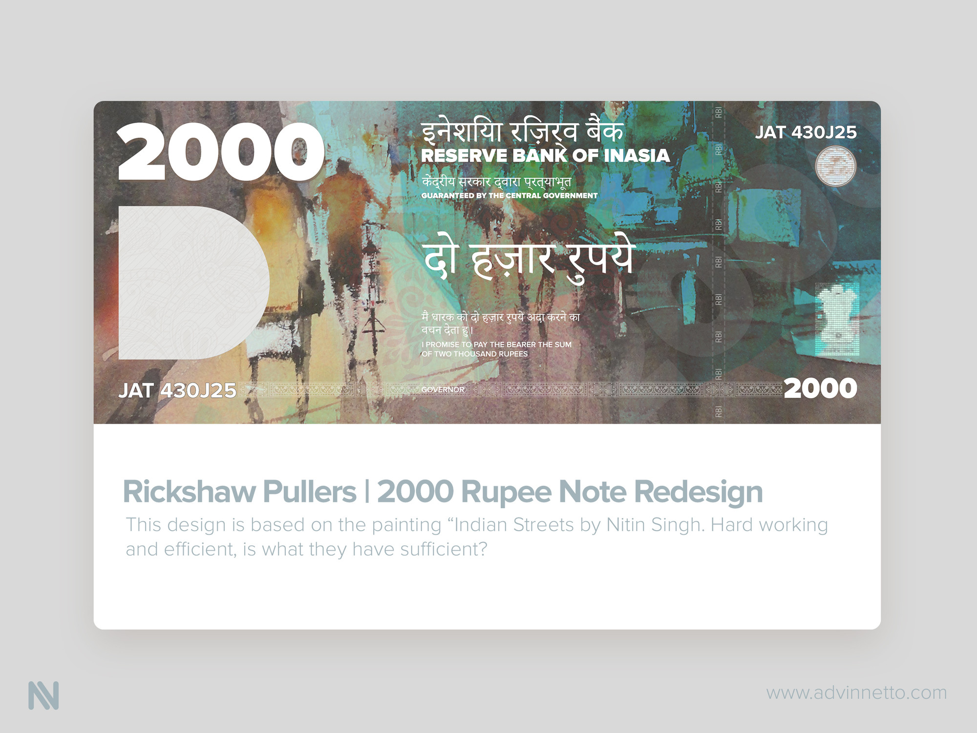
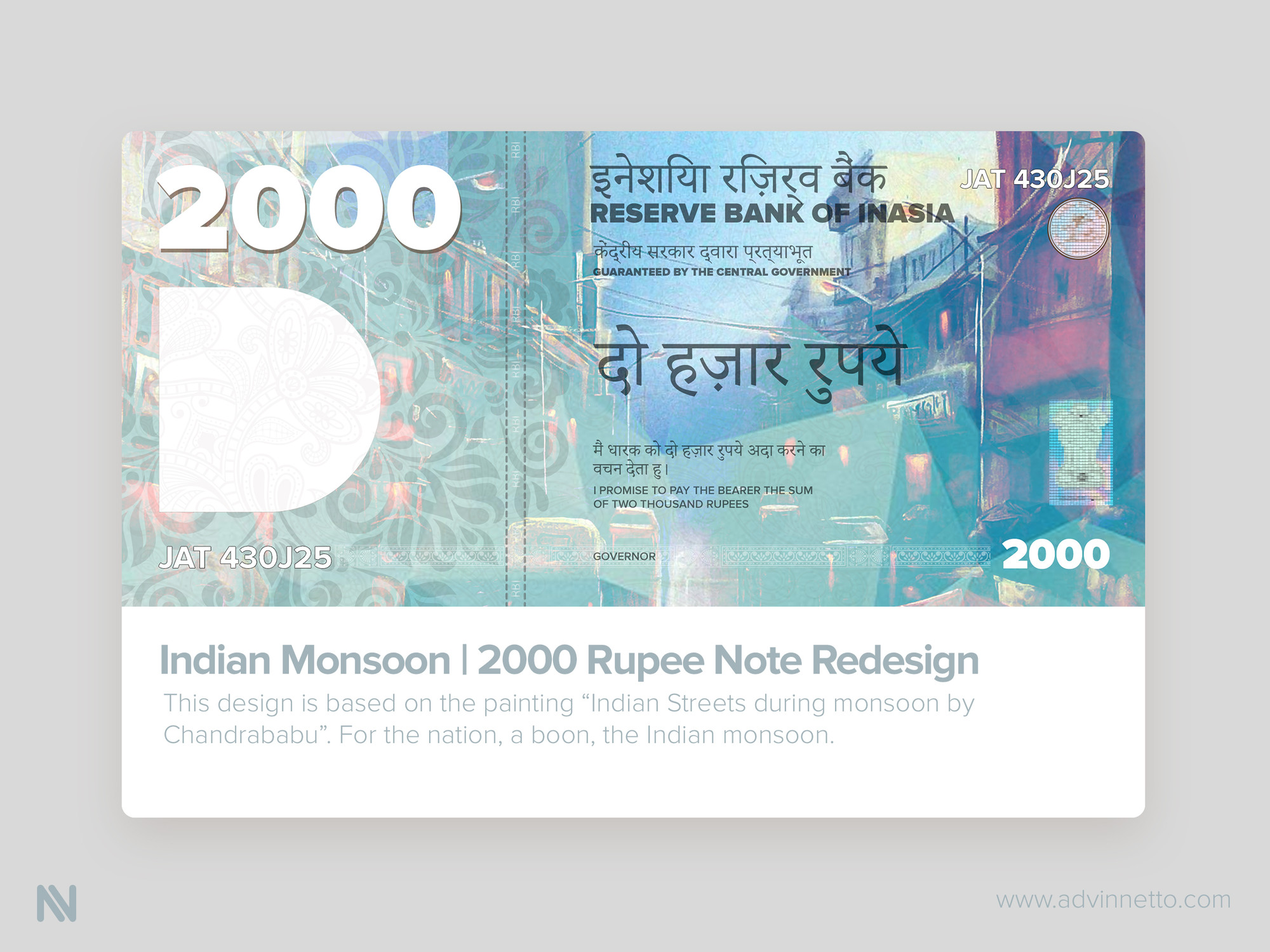
Here are few concept designs of India’s new Two Thousand Rupee currency.
PS- This is my view and it can be subjective.
I felt really bad after seeing the new currency. The size is small (which is ok, but every note should be redesigned, or else a 100Rs note is going to be bigger than the new currency launched).
All other notes have a character, whereas the new one doesn't. I felt like it is a last minute job. I am not saying the designs presented here are perfect, these are just my views. But if I get it as a project or get a chance to spend time dedicatedly for this, I think I would be able to do a much much better job.
I haven't thought much about the security concerns on the designs here. I might have to do a lot of research on how to do that. I would be interested in working it out as a team if anyone is interested.
The typography, aligning of elements, masking of elements, colour, everything about the new currency is below par. The more I look at it the more disappointing it gets. :(
Let me know what you all think.
Thank you :)
